Spring–Summer Color Palettes for Beautiful Portrait Photography
How the Right Colors Can Completely Transform Your Outdoor or Studio Session
By Yesika Wong. Pacifica, May 15th, 2026
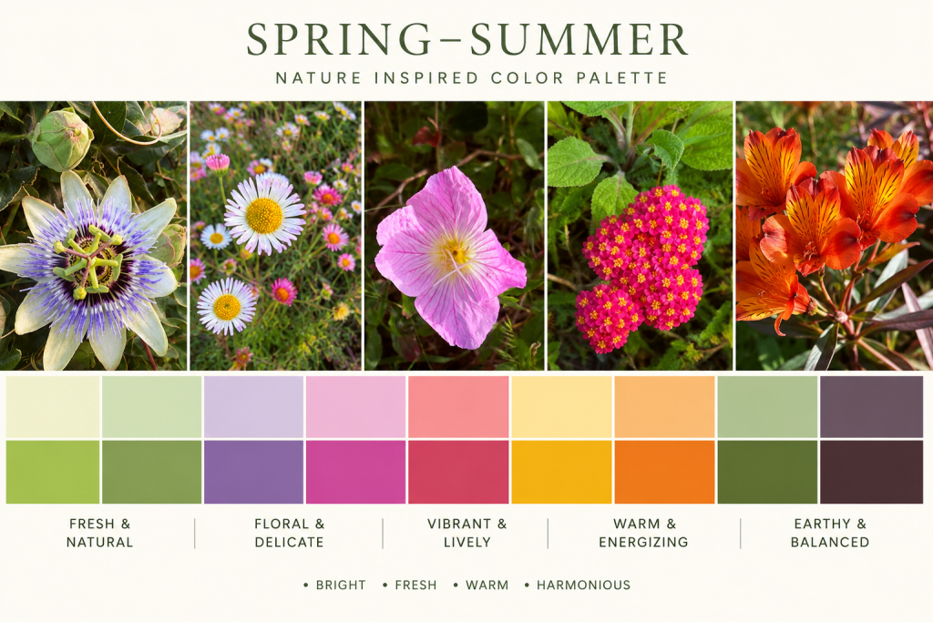
Spring and Summer are full of life, texture, movement, and natural color. Flowers bloom everywhere, the sunsets become warmer, gardens turn vibrant, and the light becomes softer and more cinematic. It is one of the most beautiful times of the year for photography.
At YSIPIX Photography, one of the most important parts of preparing a portrait session is planning the color palette before the session day. It may sound simple, but wardrobe colors can completely change the mood, depth, elegance, and emotional impact of your final photographs.
A thoughtfully planned palette can improve the composition and visual harmony of your session dramatically. Colors affect how subjects separate from the background, how skin tones appear on camera, and how timeless the final images will feel years later.
When colors work together naturally, photographs immediately feel more polished, emotional, artistic, and intentional.
This Spring–Summer season, nature itself is inspiring the palettes we love most.
Why Color Planning Matters So Much in Photography
Photography is not only about the people in front of the camera. It is also about harmony inside the frame.
The right color palette helps:
- Create visual balance
- Guide the viewer’s eye naturally
- Enhance skin tones
- Add emotional depth
- Avoid visual distractions
- Make group portraits feel cohesive
- Improve the relationship between subjects and environment
- Create a more editorial and polished final gallery
Without color planning, even beautiful locations can feel visually chaotic. Strong logos, random patterns, neon colors, or mismatched outfits can break the emotional connection inside the image.
But when colors complement each other naturally, everything changes.
The photographs begin to feel:
- More cinematic
- More intentional
- More luxurious
- More emotional
- More timeless
This is one of the biggest differences between casual snapshots and professionally styled portrait photography.
Outdoor vs Studio Color Choices
Outdoor Sessions
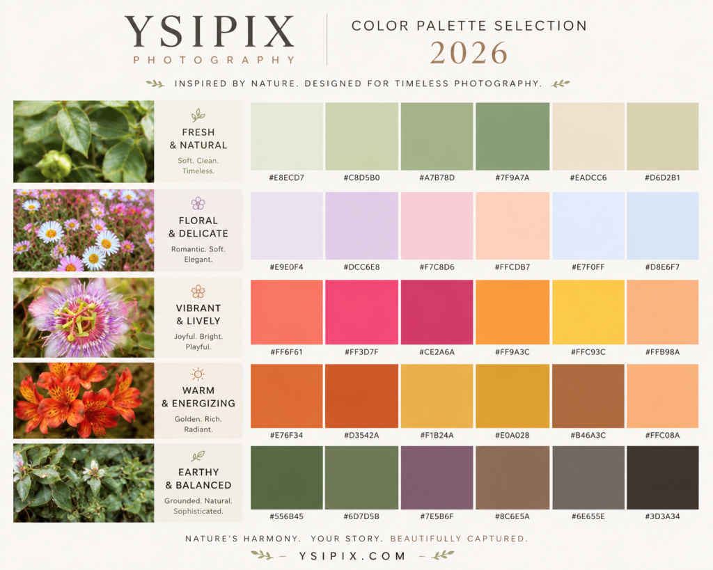
Nature already contains many colors, textures, and visual layers. For outdoor photography, softer earthy tones usually work best because they blend naturally with the environment.
We often recommend:
- Sage
- Cream
- Dusty blue
- Warm neutrals
- Soft florals
- Muted warm tones
These colors allow the people to remain the focus while still feeling connected to the landscape.
Studio Sessions
Studio photography gives more freedom for bold styling because the environment is controlled.
For studio portraits, we can explore:
- Elegant monochromatic palettes
- High contrast editorial looks
- Soft luxury neutrals
- Bold fashion-inspired color combinations
- Fine art minimalism
Studio sessions are perfect for creating sophisticated and timeless portrait work with intentional lighting and styling.
The Goal Is Authentic Beauty
At YSIPIX Photography, the goal is never to make people look artificial or over-styled.
The purpose of color planning is to enhance authenticity — not remove it.
Beautiful photography happens when:
- People feel comfortable
- Colors feel harmonious
- Light feels natural
- Movement feels real
- Emotions are genuine
That combination creates portraits that remain beautiful for years.