
What to Wear for Fall Family Photos 2026. Bay Area Color Guide
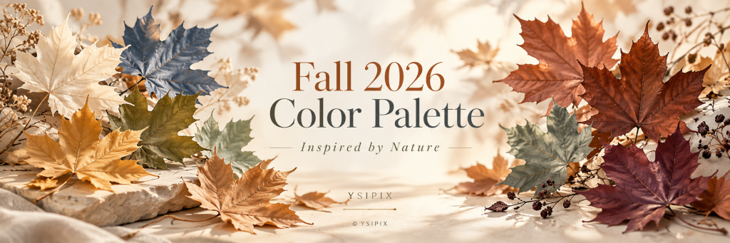
Discover YSIPIX Photography’s Fall 2026 color palette for family, maternity and portrait sessions, inspired by the golden grasses, eucalyptus greens, coastal fog and natural tones of the San Francisco Bay Area.
Inspired by Nature, Designed for Beautiful Photographs
There is something special about fall in the San Francisco Bay Area. Our autumn does not always arrive with forests filled with bright orange leaves. Instead, nature changes more quietly. Hills become golden, grasses turn warm and textured, eucalyptus trees keep their soft green tones, coastal fog introduces beautiful blue-gray shades, and the afternoon sun becomes warmer and lower. For me as a photographer, these natural colors are part of the story. Choosing what to wear for your fall photography session is not simply about finding colors that are considered “seasonal.” It is about creating harmony between your family, the landscape, the light, and the feeling you want your photographs to preserve.
The YSIPIX Fall 2026 Palette
For this season, I am drawing inspiration directly from the landscapes I photograph throughout the Bay Area.
Golden Grass
Warm ochre, camel, honey and muted mustard reflect the dry grasses covering our California hills in late summer and fall.
Eucalyptus & Olive
Sage, moss, muted olive and deeper forest greens work beautifully around coastal trails, trees and open fields.
Clay & Terracotta
Think muted rust rather than bright orange. Clay, cinnamon, terracotta and warm sienna bring warmth without competing with the landscape. Muted Clay is also one of Pantone's featured Autumn/Winter 2026–27 colors.
Redwood & Mahogany
Deep brown, chocolate, warm burgundy and red-brown create richness and depth. Pantone's 2026 palette includes both Arabian Spice and Red Mahogany, while burgundy remains prominent in Fall 2026 fashion.
Coastal Cream
Ivory, oatmeal, warm white, beige and soft stone are wonderful foundation colors. They catch light beautifully and allow faces and expressions to remain the focus.
Pacific Fog
Blue-gray, slate, dusty denim and muted ocean blue belong naturally to our Bay Area palette—especially for sessions near the coast.
Wild Berry
For someone who wants a little more color, muted plum, blackberry, wine and soft mauve are beautiful alternatives to traditional fall orange.
My Suggested Fall 2026 Color Story
A simple palette could look like:
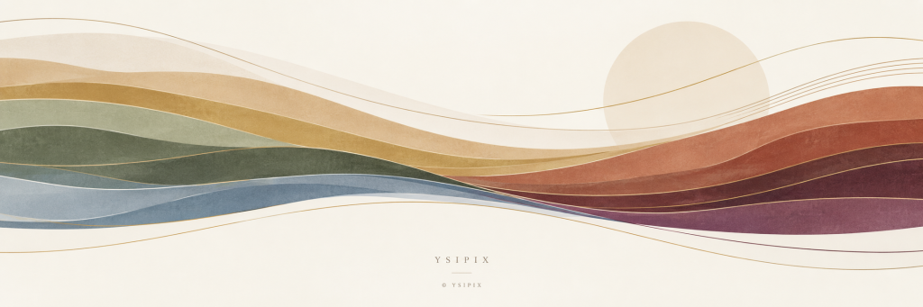
Cream · Camel · Olive · Terracotta · Mahogany · Fog Blue
Or, for a slightly more romantic look:
Oatmeal · Dusty Rose · Burgundy · Sage · Chocolate
And for coastal sessions:
Warm White · Sand · Denim Blue · Eucalyptus · Caramel
The goal is not for everyone to wear the same color. Actually, I prefer when families coordinate rather than match. For example, one person might wear cream, another muted olive, another camel, and a child could bring in a small burgundy or terracotta accent. Together, the colors feel connected while everyone keeps their own personality.
Let Nature Lead the Wardrobe
One of my favorite ways to prepare for a session is to look first at the location.
A golden Pacifica hillside already has its own palette.
A eucalyptus grove has another.
A San Francisco coastal afternoon combines warm skin tones with cool fog, sand and ocean colors.
Instead of fighting those colors, we can borrow from them.
This creates photographs that feel more cinematic, natural and timeless.
Texture Matters as Much as Color
Fall photography is also a beautiful opportunity to introduce texture.
Soft knits, linen, cotton, denim, suede, corduroy, wool and subtle layers photograph wonderfully because they interact with natural light.
A cream sweater beside golden grass.
A linen dress moving in the coastal breeze.
A warm brown jacket against eucalyptus green.
These small combinations can completely change the feeling of a photograph.
Patterns can work too, but I normally recommend keeping them subtle. When several people are being photographed together, large logos, very strong graphics or multiple competing patterns can quickly distract from faces and connection.
One Accent Color Can Be Enough
Fall 2026 also brings stronger colors into fashion, including purple, red, blue and yellow.
You do not have to avoid them.
The secret for photography is balance.
A burgundy dress, plum sweater, golden accessory or deep blue jacket can become the visual anchor while the rest of the family stays within softer neutrals.
That small contrast often creates beautiful depth.
A Photographer's Tip: Think About the Light
Your clothing does not exist separately from the environment.
During golden hour, cream becomes warmer. Brown becomes richer. Olive becomes softer. Terracotta almost glows.
On a foggy Bay Area afternoon, the same colors become quieter and more cinematic.
That is why I rarely recommend choosing outfits only from an online color chart. The best palette depends on the location, time of day, season, light and your own skin tones.
I am always happy to help my clients coordinate those elements before a session.
Fall Is Not Just a Color. It Is a Feeling.
For me, autumn photography is about warmth without forcing it.
It is the movement of dry grass in the wind.
The California light becoming softer.
Children running through an open field.
A little fog arriving from the Pacific.
Hands touching.
Layers getting closer.
And those few beautiful minutes when everything, the landscape, the light, the colors and the people you love, comes together. That is the magic I want to preserve.
Dress for the landscape. Bring your personality. Let nature do the rest.
Note and References: This Fall 2026 color palette was curated and interpreted by Yesika Wong, Founder and Lead Photographer of YSIPIX Photography, combining seasonal color research with inspiration from the natural landscapes of the San Francisco Bay Area. References include the Pantone Fashion Color Trend Report for Autumn/Winter 2026–2027 and Vogue’s Fall 2026 color trend coverage. The final palette, styling recommendations, and photographic interpretation are original to YSIPIX Photography and were developed through Yesika’s experience working with natural light, local landscapes, and family portraiture throughout the Bay Area.